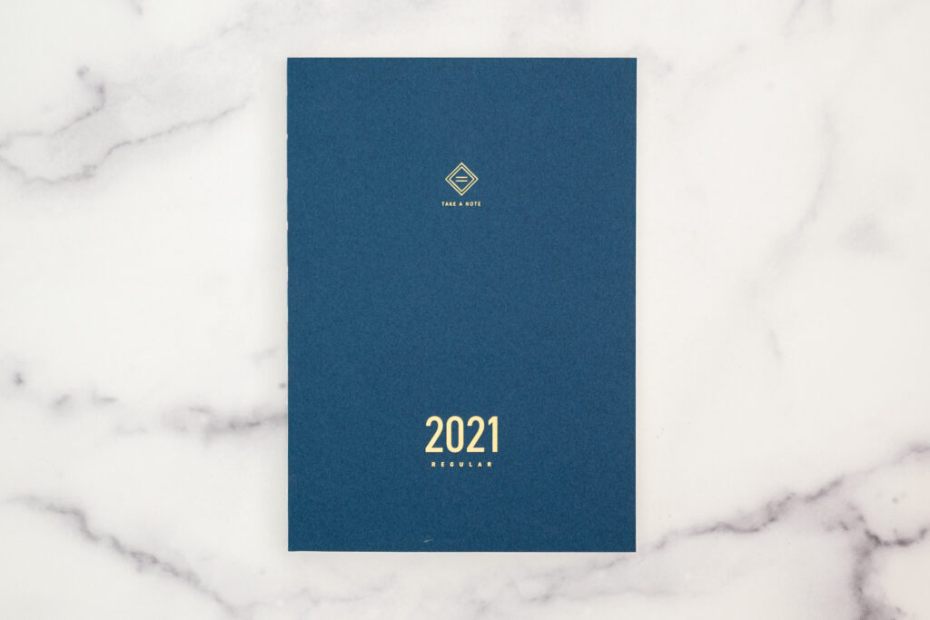
The Take A Note Planner
A while back, I thought I might want to use a planner that did NOT have daily pages like my Hobonichi Cousin. Enter, the Take A Note Planner.
I was excited to get started, so I started to play with it at the end of December. Here are some of my thoughts!
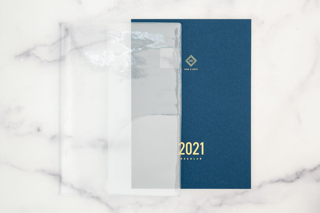
The color of the Take A Note Planner changes every year, and this year it is this gorgeous blue. And it comes with a clear sleeve too! How awesome is that?!
It starts like many other planners do, with a yearly overview and a yearly tracker.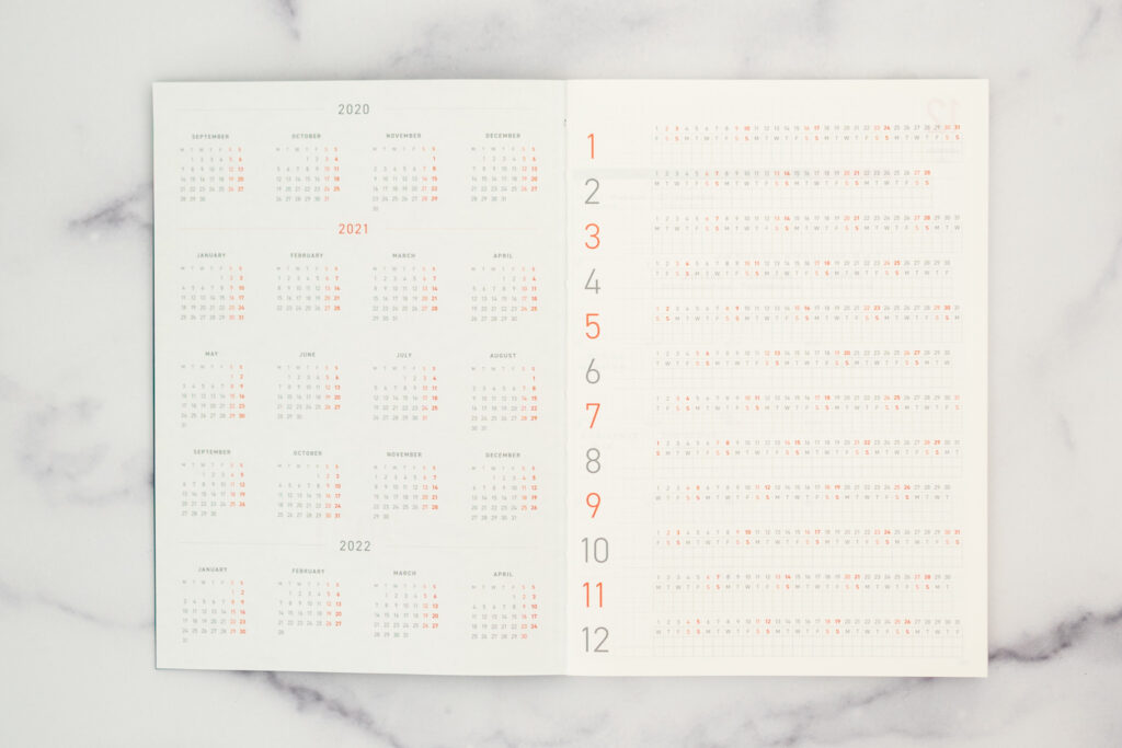
Then come the monthly spreads. I planned out January with a little bit of color coding, but I think this is the moment I realized this planner might not be for me.
The boxes for each day are a lot smaller than in the Hobonichi Cousin. I think if I knew how to hand letter I would write the month at the top in big beautiful letters, and maybe keep a habit tracker on the left-hand side. But with the way I plan, I would prefer the days to be bigger boxes.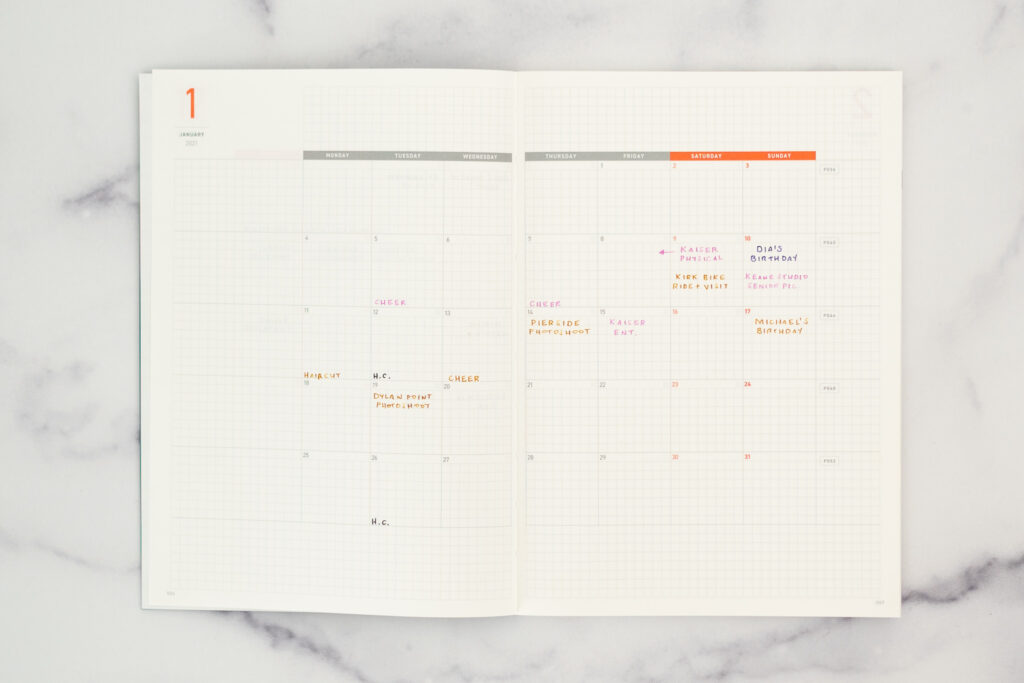
Here’s a blank monthly page for ya!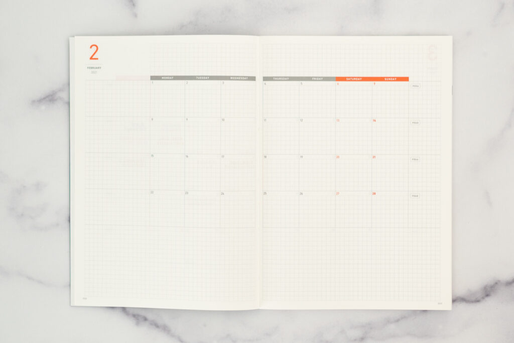
The weekly pages were what I was most excited about! I love that there is a weekly spread on the left page and that each day has an extra wide column. But because of this, the week has to be on two spreads. This became an issue for me. You can watch my video below for a better explanation.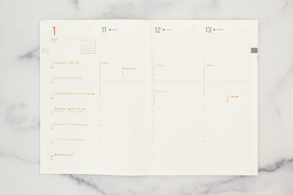
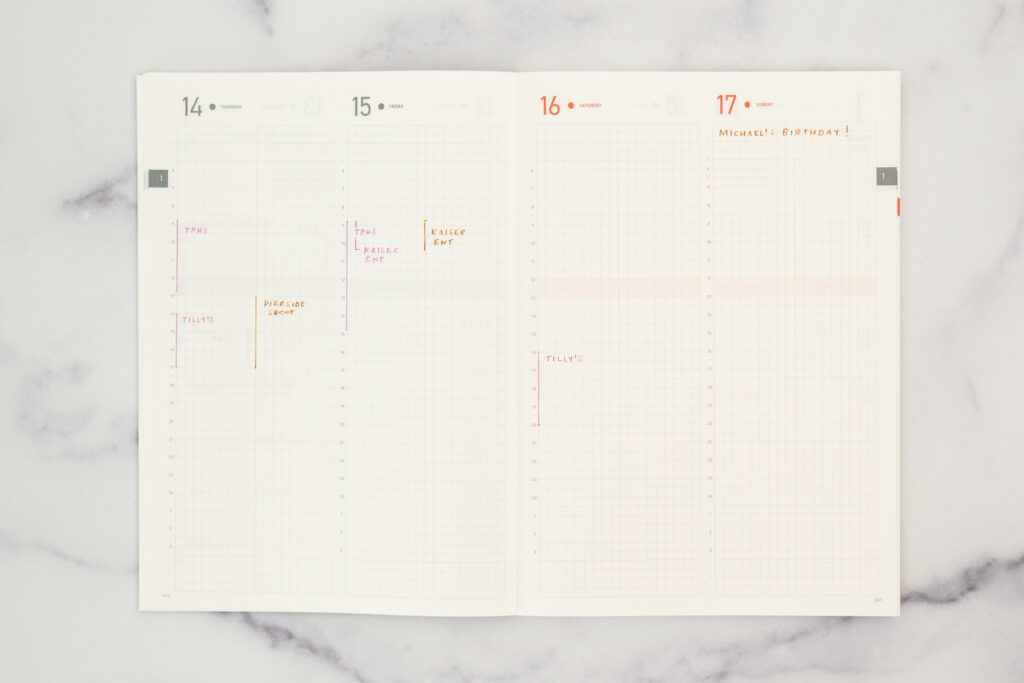
And again, here is a blank weekly spread.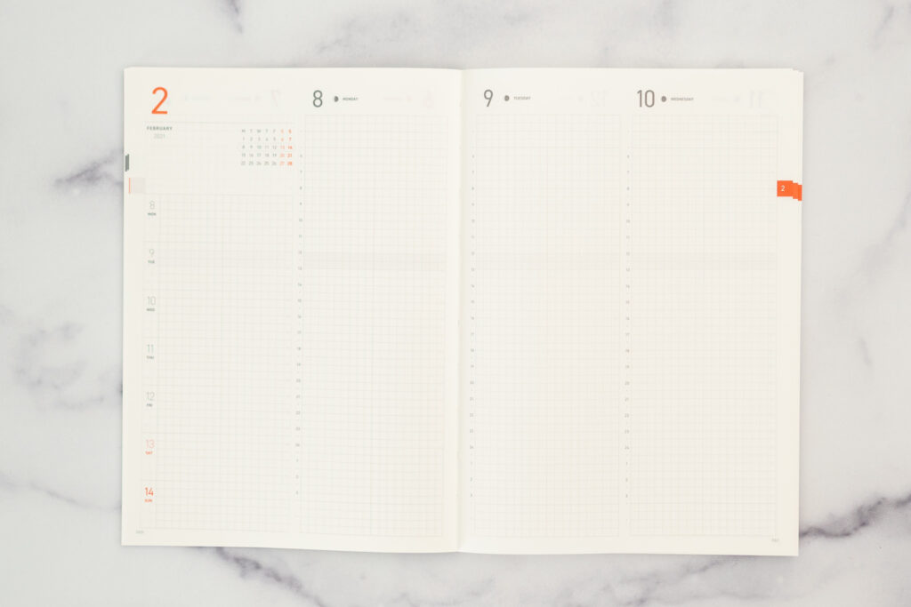
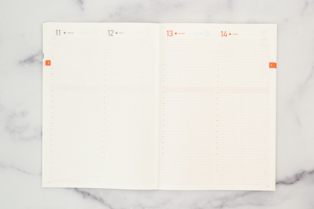
At the end of the planner are a few grid pages, and that’s about it!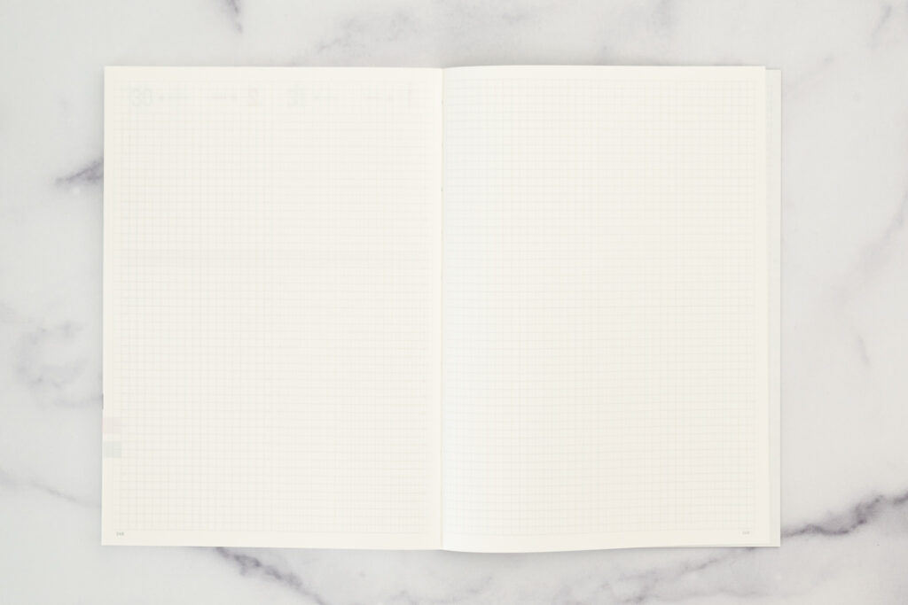
If you want to go a little deeper into my thoughts on this planner, be sure to watch my video!

