Giving the Wordsworth Planner a try!
The Wordsworth Planner
I love planning in a ring-bound notebook, and never thought I would do otherwise until I got my hands on a Passion Planner. It is now a huge part of my everyday planning and memory-keeping. So, I thought, why not give other planners a try. You never know when you might find one that perfectly suits your needs at the time. So when Wordsworth planner reached out and asked me if I would like to give their planner a try. I said YES! I was a little hesitant at first because I am very happy with my current planning system, but I decided to give it a shot.
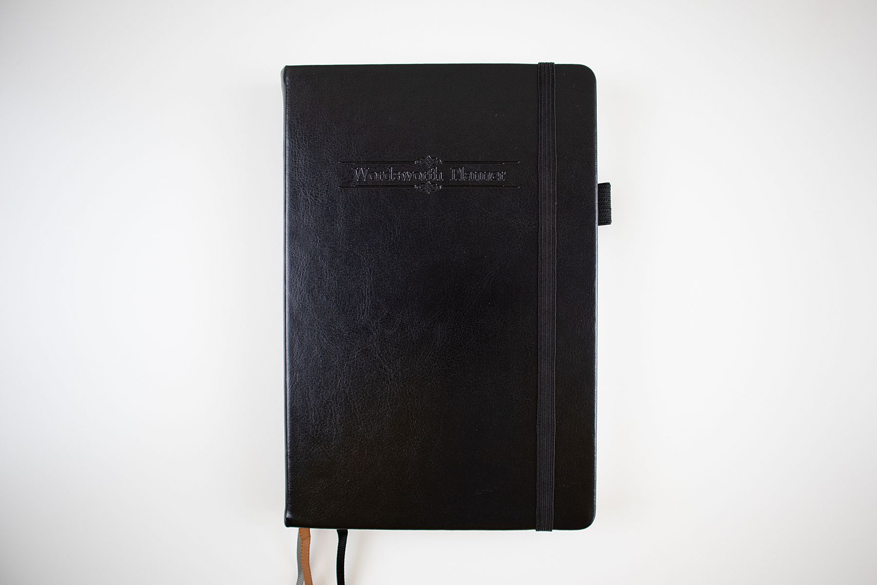
Here is a peak inside the planner that they sent to me. It is an Undated Weekly Horizontal Planner. They also have a Weekly Vertical Planner and a Daily Planner. The planner is hardcover and comes in several different colors (black, brown, blu, and pink).
It has three ribbon dividers and an elastic pen loop…huge plus in my books!
It starts off with a title page and a layout on how to use the planner. I’m pretty sure it came with a card explaining how to use each section and giving examples…but I lost it 🙁
There is a section for travel planning and the different time zones, but I don’t find much use for these.
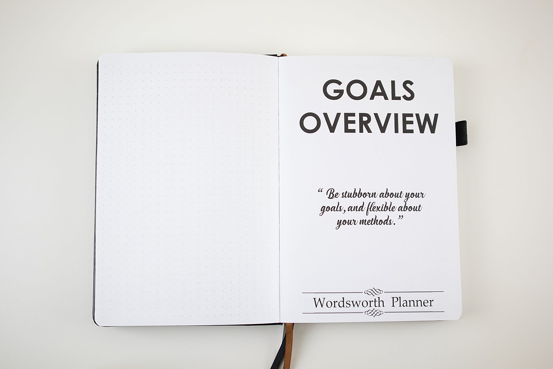
Goals Overview
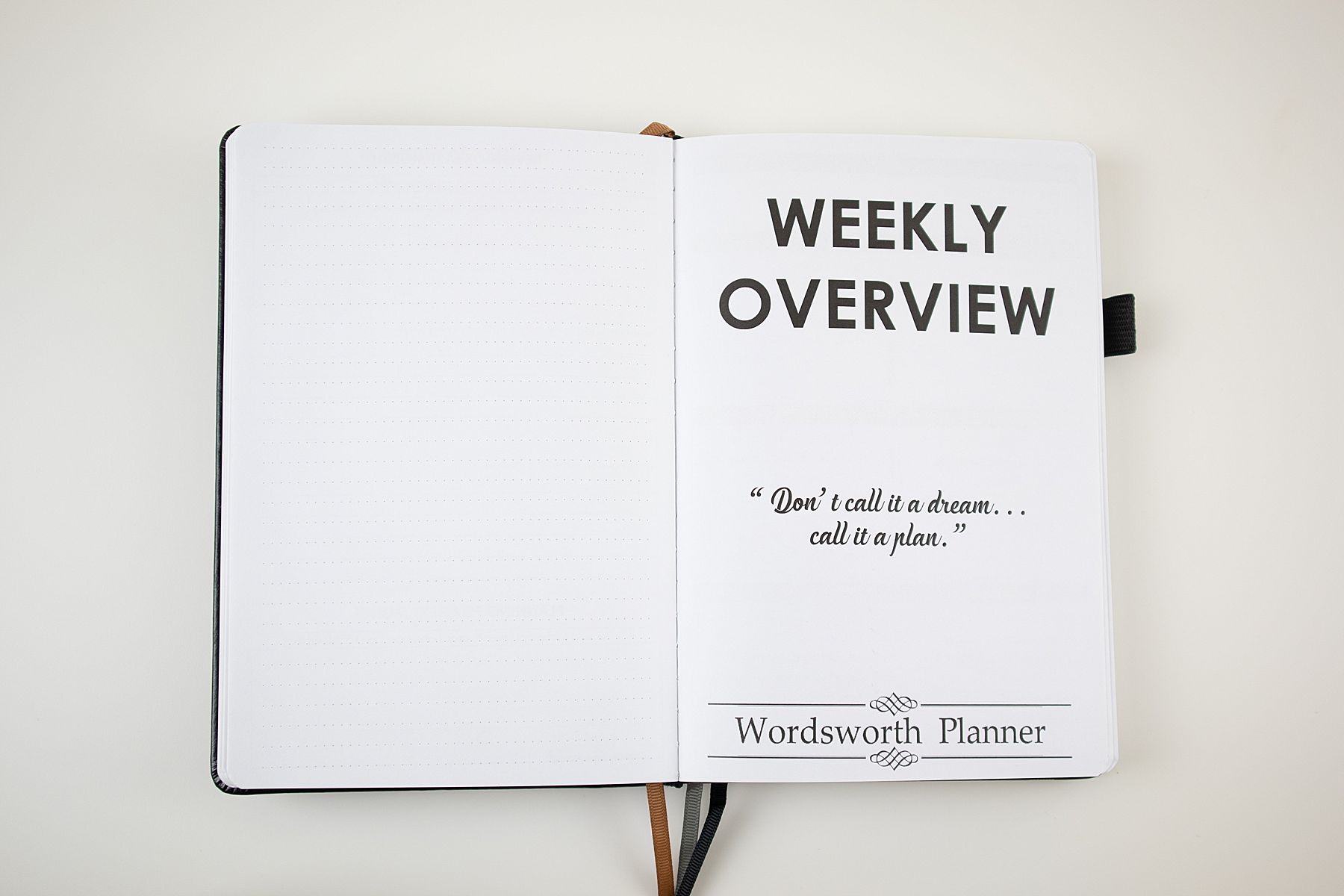
Then begins the Goals Overview Section, with a quote.
There is a place for Mind Mapping and your Vision Board.
And then the goal planning is broken down into three sections: Personal, Family, and Professional. I feel like they made the goal-planning process very simple too! Just choose a goal and a target date, find your purpose, and then create your action steps.
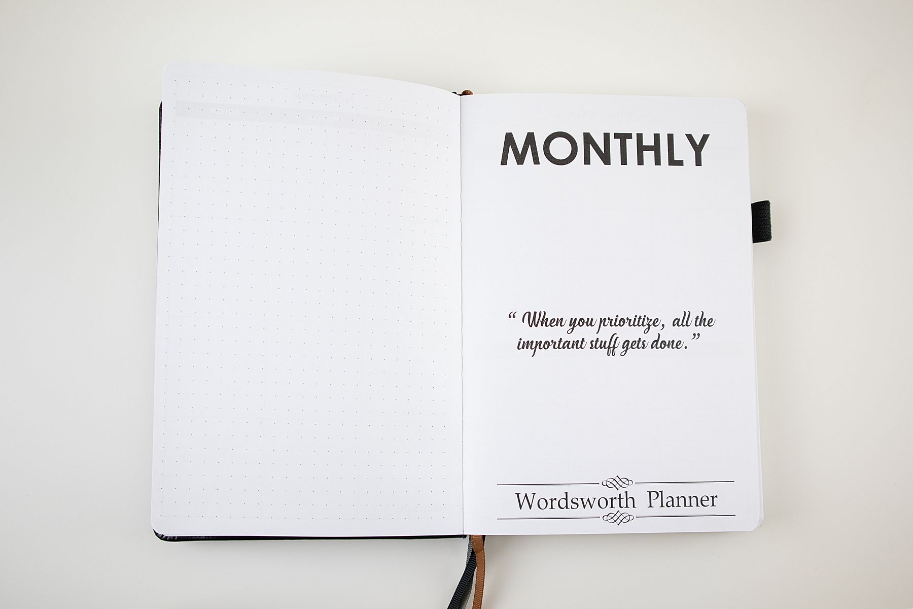
Monthly
Now, onto the monthly section!
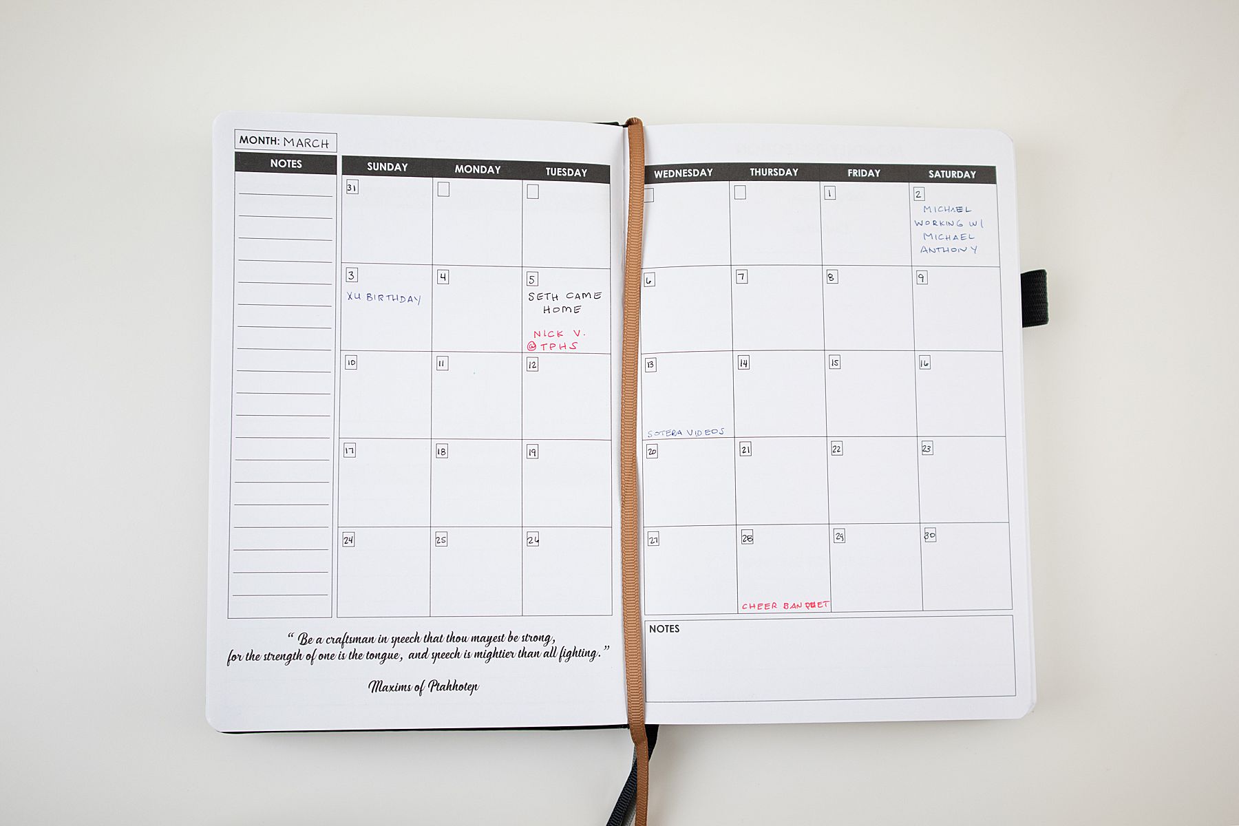
As you can see, I didn’t enter much. While I love that the calendar stretches from the top, almost all the way to the bottom, the date boxes are just too small for me. This is when I wish I was a sticker gal, I would have liked to just cover up the boxes that way.
I’m not sure why, but I tried to color-code the monthly events and I just didn’t like it. If you follow me on any of my social media, you know I normally gravitate to black…clean and simple. I didn’t like the way it was turning out, so I just gave up.
The page on the left comes before the actual Monthly Calendar, and it’s a space for you to write out your monthly goals in the same format as before.
On the right, we have the page that comes after your month. This is a space for you to reflect and begin planning for the next month.
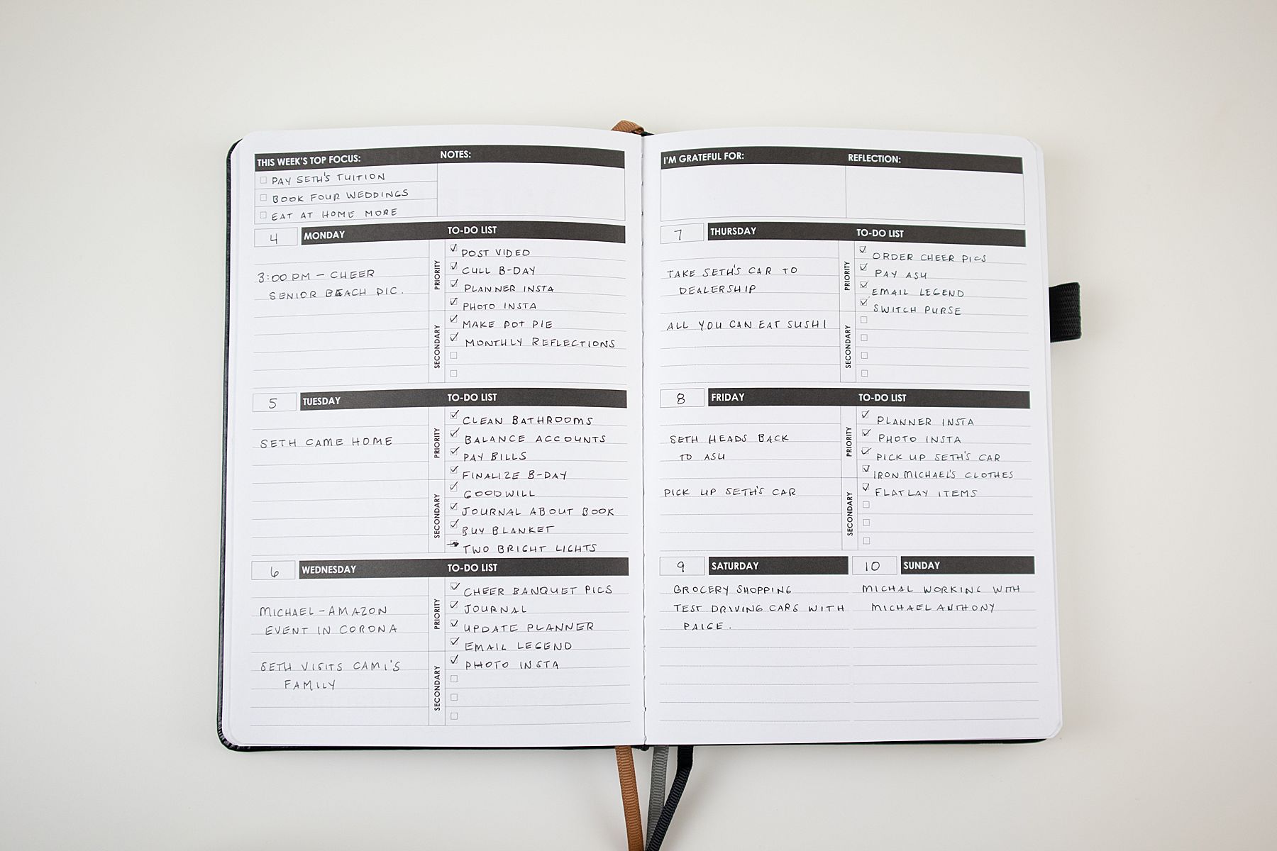
Weekly
Although I love the space that this layout provides, it’s just not right for me. I have fewer appointments and lots of to-do items, so I like a bigger space for that. I can see this layout being great for a student!
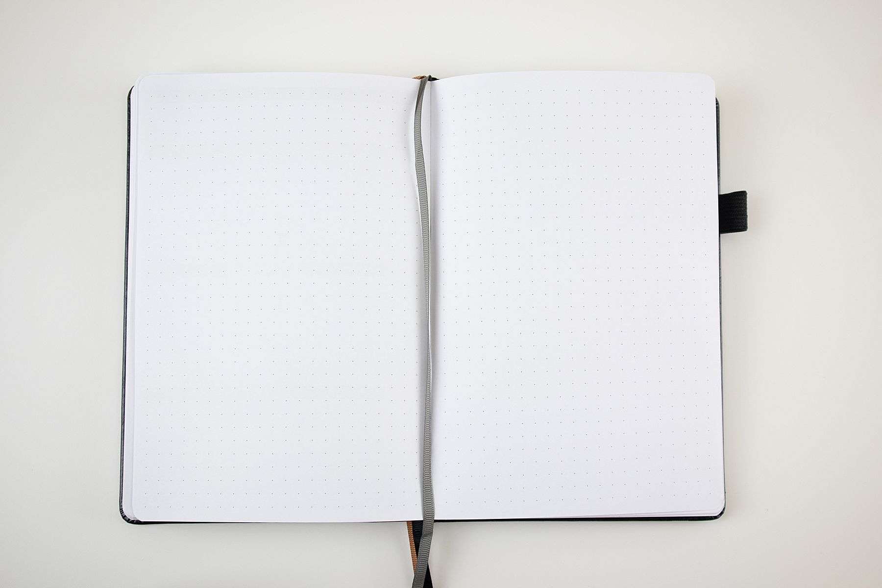
In the back are a dot grid and blank pages for you to use as you please. In my Passion Planner, I use this section as a vision board and to keep my bujo-style trackers.
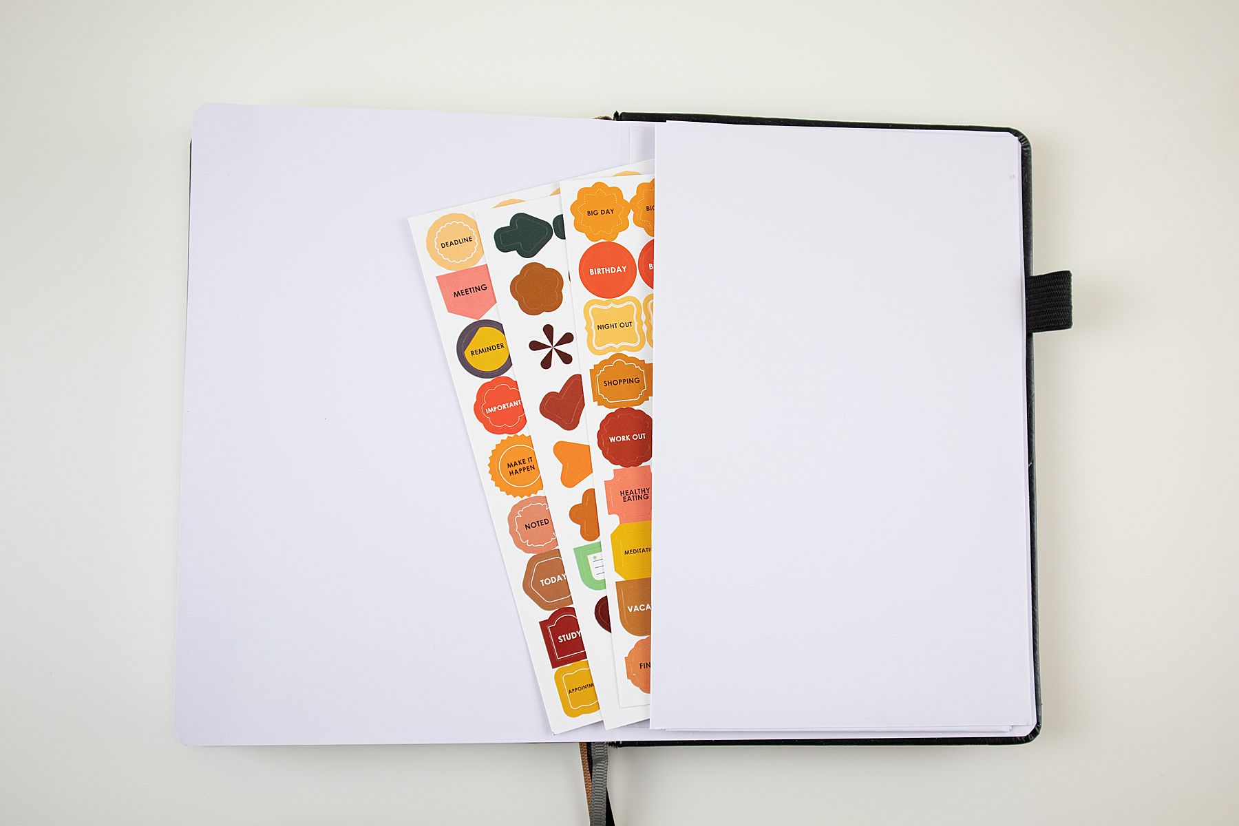
On the back cover is a pocket that you commonly find in these types of planners. The only downside is that it is made of paper, and I imagine it can rip fairly easily.
If you would like to see more of my thoughts on this planner, check out my video!







The Comments
Smita Singhal
I’m glad ‘Designing Your Day’ helps you feel that bit more organised and in control. Every little bit helps, right?! And yes, getting into the habit of thinking ahead of time of what you’ll need to take with you (instead of leaving it to last second!) is a great sanity saver.
Keep your goals in sight, you’re doing great!